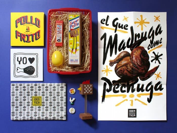
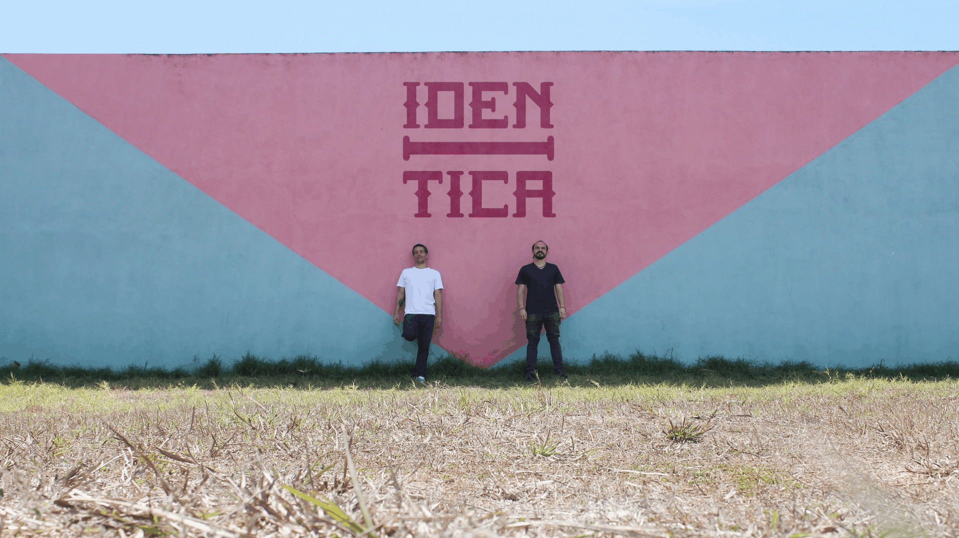
Graphic designers Juan Manuel Betancourt, of Venezuela, and Claudio Corrales, of Costa Rica, have joined forces on a unique project that encourages Ticos to appreciate the imagery in their daily lives. Iden-tica gathers Costa Rican popular art from sources such as street murals and lettering, packing and advertisements; it has grown into a local brand featuring magazines, collectibles and pins, and been featured around the world at events such as the Paris Salon du Livre (2014), and the Iberoamerican Design Biennial in Madrid (2014).
Betancourt has been living in Costa Rica since 2003. Between 2004 and 2009 he directed the Revista Colectiva, a collaborative project that gathered a collective of illustrators from all over the world; he founded Iden-tica in 2013. Corrales works as a full-time graphic design professor at the University of Costa Rica (UCR) and joined Betancourt on the Iden-tica project in 2014.
On a calm, beautiful evening at Betancourt’s apartment in Los Yoses, The Tico Times sat down and spoke with Betancourt and Corrales about the Costa Rican “look,” street lettering, and, of course, fried chicken. Excerpts follow.
How did the project come to be?
J: I started the “chicken project” as a hobby… [depicting the fried chicken] you see every day on the streets. I had to do something with all the material I had. During that same time, I started documenting photographs graphic lettering, typography and characters. I reached a point where I had to find a way to pour it all out.
C: It has been an educational process because it started out as a magazine, but it has developed into a brand. Iden-Tica is not only about the editorial side and products; it’s about the educational part.
J: We feel we’ve opened many people’s eyes. This is what you see on your daily life, but don’t take a glance at it.
C: The strongest message of our project is to look inward to the national or Latin American identity. This generates empathy towards it when we’re on our search for it. Latinos are very antipathetic toward the idea that we have an identity. With the project we’ve strengthened that idea of identity.
How would you define the Costa Rican identity?
J: What might seem day-to-day for you might not seem that way for someone who comes from another country. When you’re a foreigner and are eager to fall in love with a new place, that’s what defines it. Since I’m a lover of art, photography and design, everything caught my attention, even the streets and buses. It didn’t matter if I walked from the Caja to the Coca Cola, if there were lots of people or if it was raining: I was in love with the place. The first “mascot” that caught my attention was the chicken.
C: I’d define the Costa Rican identity through color, noise, and saborrr (flavor).
J: And fat and the fried chicken smell. I remember when I got here and traveled by bus. I’d go to Manuel Antonio, Jacó and other beaches. I was surprised when people would get on the bus with their fried chicken bag and leave the bus impregnated with the smell.

What is the most interesting mural or popular graphic lettering you’ve encountered?
C: With the graphic lettering and typography there is a lot of interesting work [by street artists]. Mr. Masking [in San José] has a very developed typographic system. In Alajuela you’ve got El Pintor and El Pintor has a typography that has all of Alajuela lettered.
J: San José is very typographic and Alajuela is very character-based.
C: There are areas in which these two things are combined on a graphic level, but what other things do we discover? The people. Being able to speak with the people who make these works is the most interesting part.
J: It often happens that you’re taking a photo, and suddenly, someone tells you to knock on someone’s door because the person who painted it is there. People also tell you the person’s name and you end up meeting someone who’s not a painter. We sometimes get to a place and are invited into this person’s house. We end up discovering the same lettering within the person’s house.
C: Or you’re invited to come in and end up eating bread with natilla and drinking coffee.
How would you define Costa Rica in colors?
C: I’d define Costa Rica as a very rich and ample chromatic range. There are tons of aesthetic possibilities. On a color usage level there’s certain affinity toward various specific colors, especially within the more urban zone. The colors turquoise and pink are always present. You’ve got the different shades of light blue, pink and the mixture of these. For example, half of the painting is one color and the other half is another color. Most of the time, the majority of the lettering is done with primary colors such as black, red, yellow and blue. I think it’s due to the idea of economizing the paint.
J: Or maybe it’s about the opportunity of using the leftover paint they have at that moment.
What captures your attention?
J: In my case it’s the street. It’s the biggest existing museum because I like going out and looking at all the details that surround it.
C: What Iden-Tica has awakened within me is the understanding that if a city is not used, it gets lost. This has awakened my desire to out walking a lot. That’s the only way to really get to know a city or a town.
J: You’ve got to value the place where you are. Even if it’s small and it’s not modern, it’ll have its own flavor. It’s about getting out, discovering, and trying to offer that vision to people who impede themselves from looking at it that way.
C: And not having that fear that people often have when they say they don’t go to certain places because it’s dangerous. There are people just like us there. Wherever there are people, there are also possibilities.


